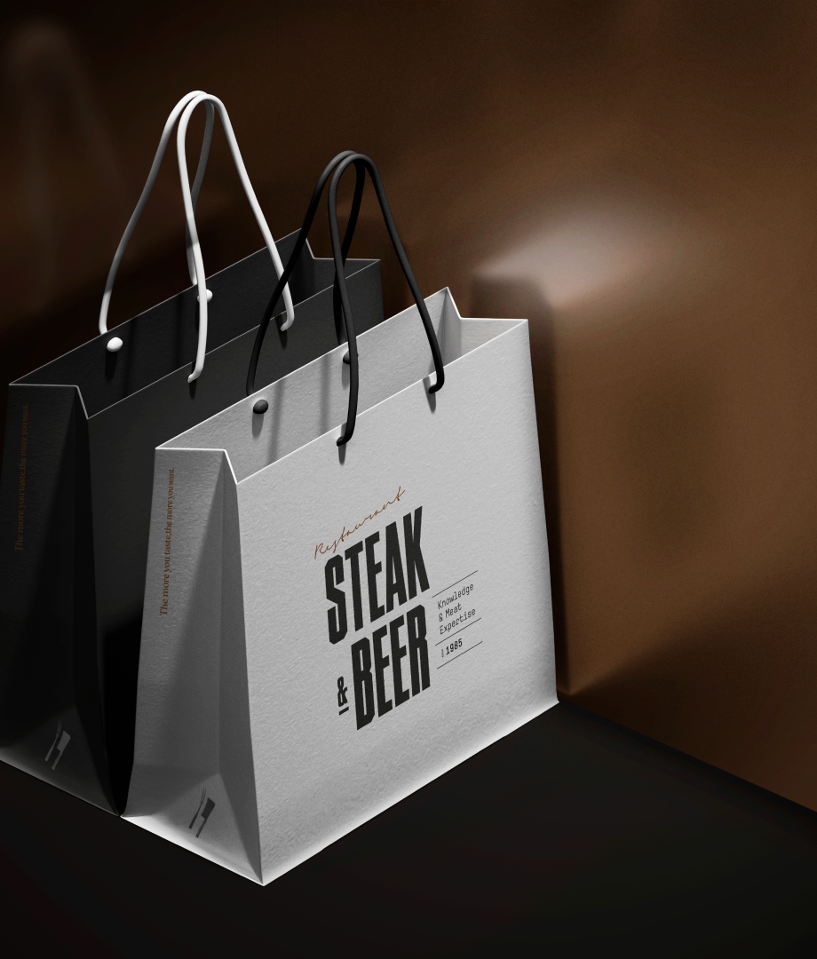
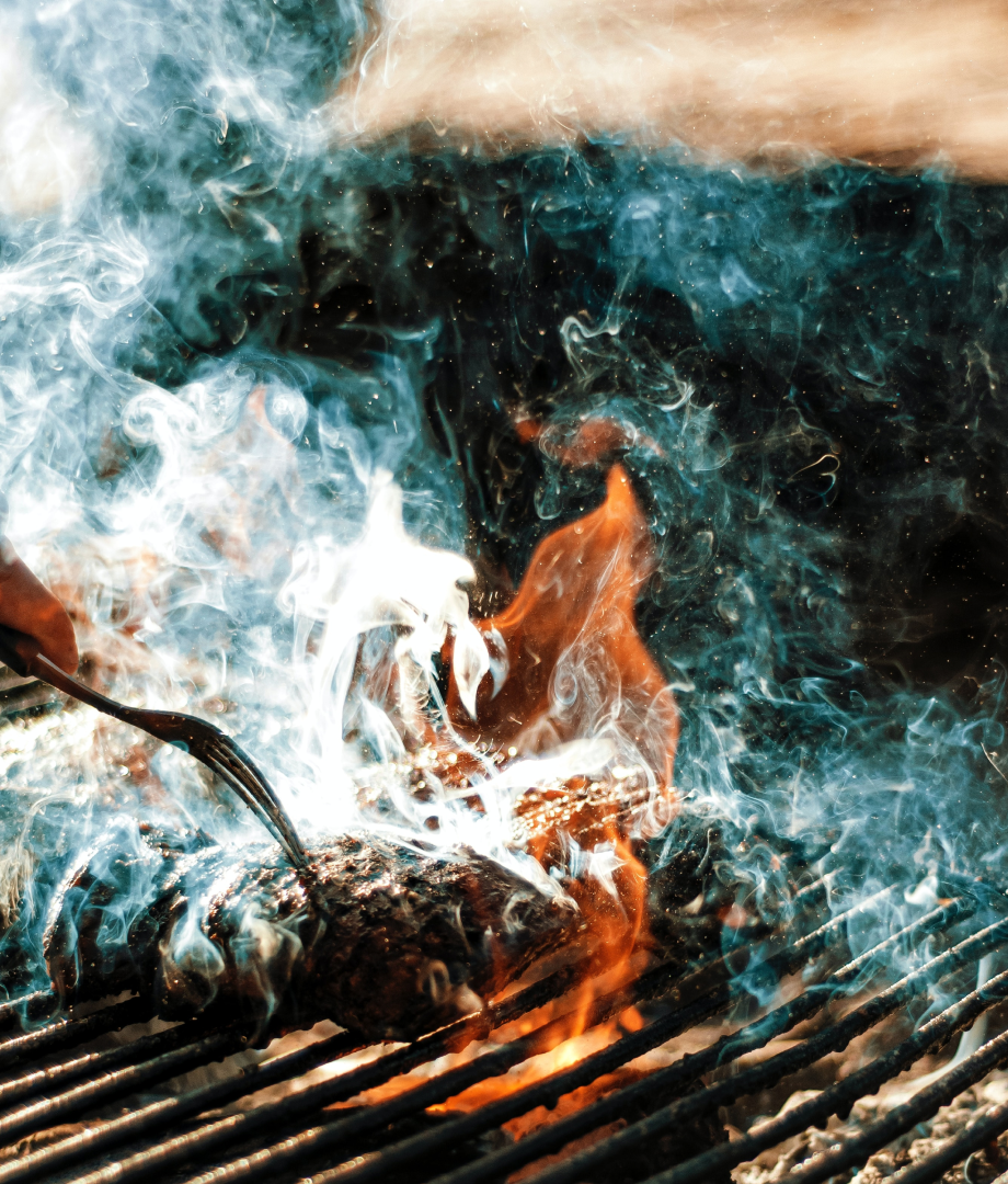
We are thrilled to present this new design challenge – the branding of Steak & Beer, a restaurant that celebrates the art of meat cuisine while offering a carefully curated selection of crafted brews. Our mission was to create a visual identity and ambiance that embodies the essence of this culinary experience, combining the rustic allure of meat with the vibrant world of craft beer.
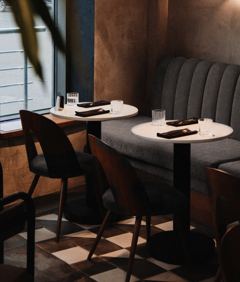
We incorporated contemporary elements, such as clean lines and sleek furnishings, to establish a modern setting. At the same time, we introduced rustic elements, such as exposed brick walls and carefully selected lighting fixtures, to infuse a sense of warmth and authenticity. The use of natural materials further enhanced the overall aesthetic, creating an inviting space that complements the culinary experience.
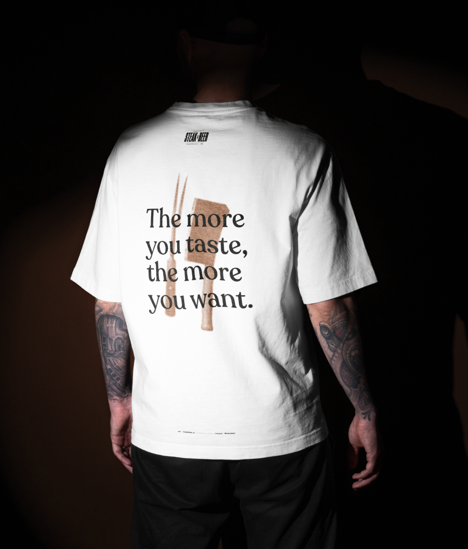
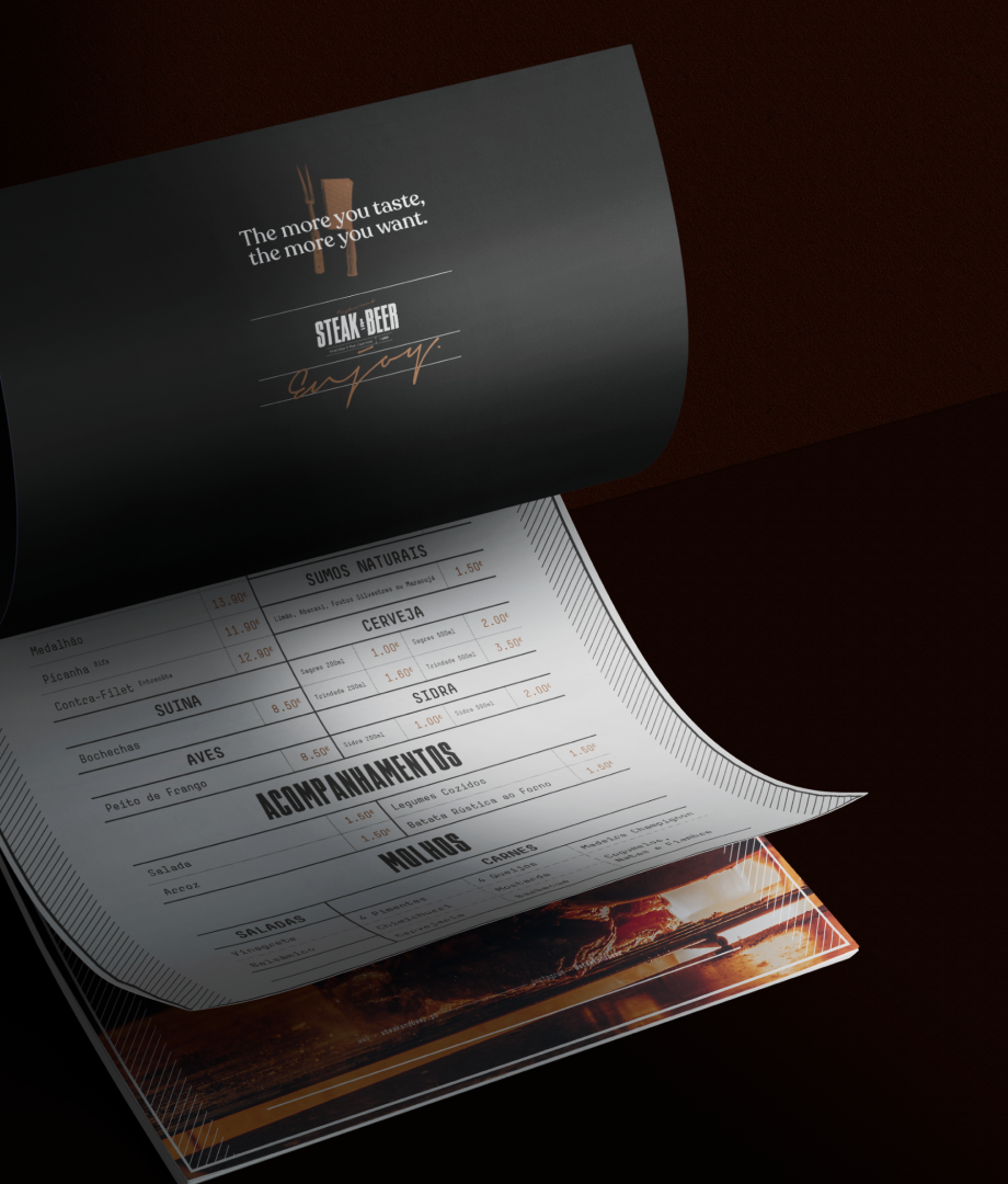
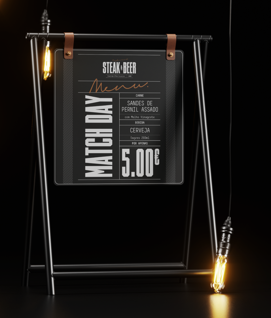
The design challenge began with the selection of a color palette that would capture the restaurant's character. White, black, and bronze emerged as the perfect combination. White, representing purity and simplicity, set the stage for an elegant and timeless atmosphere.
Black, with its sense of sophistication and depth, added a touch of drama to the overall design. Bronze accents were introduced to infuse warmth and richness, paying homage to the artisanal nature of the offerings.
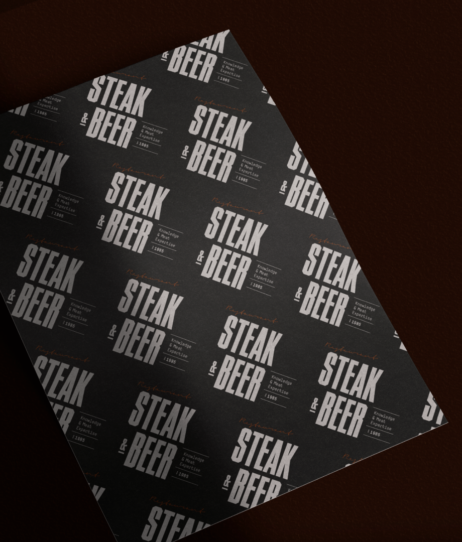
Creating a cohesive visual identity for Steak & Beer required a thoughtful approach. The logo became the focal point, capturing the essence of the restaurant's concept.
In conclusion, the rebranding of "Steak & Beer" presented an exciting design challenge that required capturing the essence of a restaurant focused on meat cuisine and crafted brews. Through a careful selection of colors, attention to detail in the visual identity, and a blend of elegance and rustic charm in the interior design, we have successfully created a captivating environment that invites patrons to indulge in the pleasures of exceptional food and drink.


